EXCEL 2007 Charts: Column, Bar, Pie and Line
A. Colin Cameron, Dept. of Economics, Univ. of
Calif.
- Davis
This January 2009 help sheet gives information on how to construct
charts
- Chart basics
- Column chart
- Column chart: Customizing
- Pie Chart
- Pie Chartt: Customizing
- Line Chart
- Line Chartt: Customizing
- Printing and Copying Charts
- Resizing and Repositioning Charts
It is easiest to learn chart making by hands-on experience.
CHART BASICS
To create a chart
- Select the data to appear to appear in the chart (with labels if
relevant)
- Use the Insert tab and Charts Group and click on the relevant
chart in this group.
The main types of chart used in analysis of economcis data are:
- Column chart: for comparing data across categories
- Pie Chart: for showing the relative shares of categories in a
total
- Line Chart: for showing trends in a series over time
- Scatter Plot: for showing the relationship between two series
(given later).
It can be useful to first modify the data for better presentation on
the chart. For example, for a pie or column chart we may want to order
the data by value.
Charts often automatically select chart title and/or axis or category
labels from the above data, so it is useful to choose clear short names
where possible.
Excel defaults usually lead to a chart that is reasonable but still
needs customizing.
The general approach
is to note that the chart has a number of areas:
- Chart Title
- Plot Area (the actual chart)
- The x-axis (for charts other than pie chart) which is called a
category
axis for column or line chart and a value axis for a bar chart.
- The y-axis (for charts other than pie chart) which is called a
value
axis
for column or line chart and a category axis for a bar chart.
- Legend Entry (explains the symbols used in the chart)
- Labels for the x-axis
- Labels for the y-axis.
To edit an existing chart one can select the chart (click inside the
chart
and the border becomes highlighted).
Then select within the chart that part of the chart
you wish to change and right
click to obtain the menu for reformatting the chart.
In some cases the Chart Tools group with subgroups Design, Layout and
Further details are given below.
COLUMN CHARTS
As an example consider categorical data on 1997 U.S. Health Care
Expenditures.
The data are in file healthexpendituresdata.csv
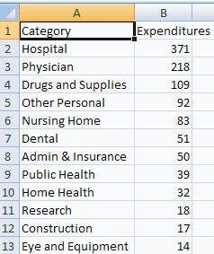
To create a column chart from the above
- Highlight the data and
headings (here columns A1:B13)
- Select the Insert Tab and Charts group and click on Column Chart
- Select the first of the 2-D Column Charts (a clustered column
chart).
This yields
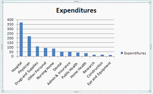
Note that Excel uses the first series (Category) for the x-axis labels
and the second series (Expenditures) for the y-axis values.
Also note the advantage to having the original data ordered in
descending value of expenditures.
COLUMN CHARTS: CUSTOMIZING
The resulting column chart is basically okay but prettier
with a better
chart title and the legend entry dropped.
- Select the Chart Title by clicking on Expenditures at the top of
the
chart.
- To change the font (size and type) right click and select font
and make appropriate changes in the Font dialog box.
- Change the name to 1997 U.S. Health Expenditures
(in $billion).
- To eliminate the Expenditures entry at the right, clicking on
Expenditures then right click and select delete.
PIE CHARTS
To create a pie chart
from the above
- Highlight the data and
headings (here columns A1:B13)
- Select the Insert Tab and Charts group and click on Pie Chart
- Select the second of the 2-D Pie Charts (an exploded pie chart).
This yields
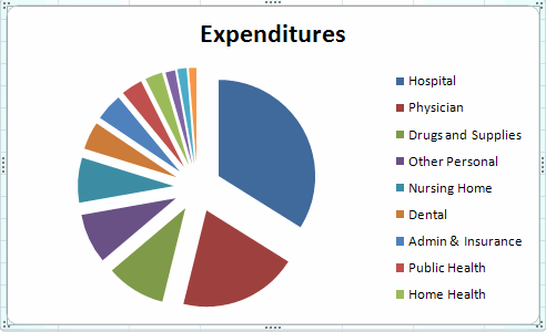
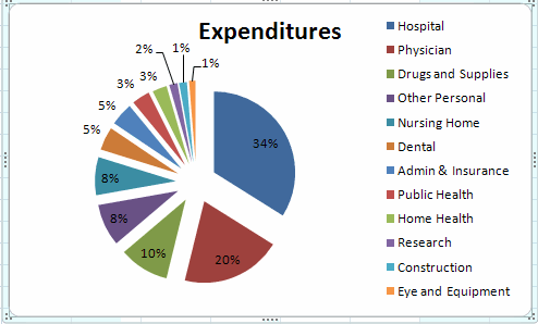
PIE CHARTS: CUSOMIZING
The resulting pie chart lacks al the category names and it might be
helpful
to include the percentage breakdown.
To get all category names
- Select the legend area by clicking on the legend.
- Move the legend up to the top of the figure.
- At the middle of the bottom drag on the box in the middle.
We obtain
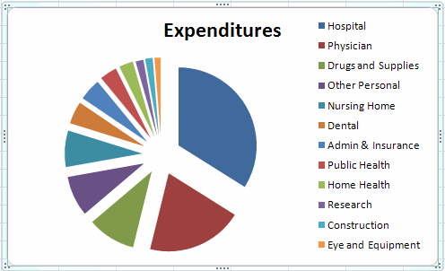
To get the percentage breakdown
- Select the main chart area by clicking in the main chart area.
- Right-click to get the following dialog box.
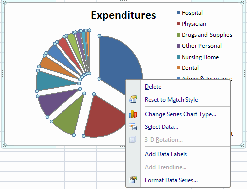
- Click on Add Data Labels which gives the values of the
expenditures (not percentages).
- Right click in the main chart area which gives the above dialog
box with the extra entry Format Data Labels.
- Click on format Data Labels and in the Format Data Labels dialog
box deselect Value and select Percentage.
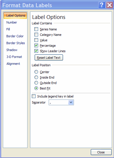
Select close and we obtain
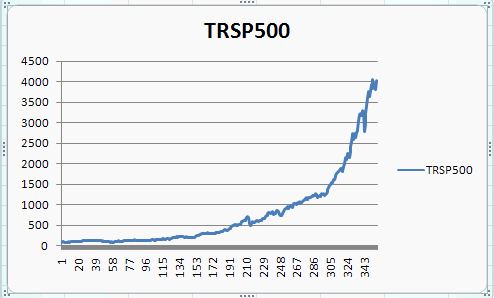
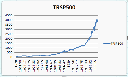
LINE CHARTS
The line chart is not really helpful for categorical data as above.
The line chart
is best used for numerical data that are observed over time.
We consider monthly data on the total return from the Standard and
Poors 500 stock index (with reinvestment of dividends) from 1970 to
1988.
The data are in file SandP500stockpricedata.csv
The first few observations are
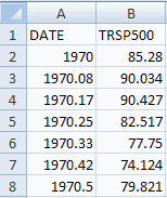
Here the months of 1970 are 1970 (Jan), 1970.08 (Feb), 1978.17
(March), 1978.25 (April), ...
To create a line chart from the above
- Highlight just the data for TRSP500 (not the date) and
the headings (here columns B1:B1359)
- Select the Insert Tab and Charts group and click on Line Chart
- Select the first of the 2-D Line Charts (a line chart).
This yields
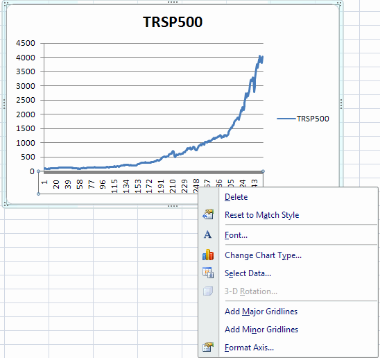
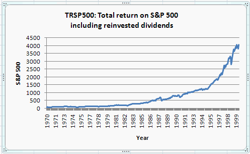
LINE CHARTS: CUSTOMIZING
The x-axes for this chart is the row number, not the date. To
change to
the date:
- Highlight the Horizintal (category) axis and right click.
This yields the following dialog box
Choose Select Data to get the following dialog box
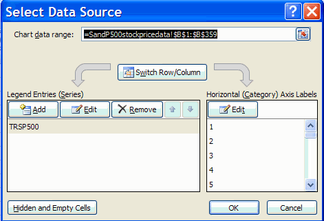
Then click on Edit to get the following dialog box
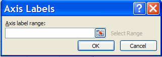
Finally
- Highlight the range A2:A359 (note that the heading DATE is not
included here).
- Select OK in the Axis Labels dialog box
- Hit OK in the Select Data Source dialog box
This yields
The displayed dates can be reduced to whole numbers
- Highlight the Horizintal (category) axis and right click.
- Select Format Axis
- In the Format Axis dialog box choose Number
- Change from general to Number; select 0 decimal places; and
uncheck use 1000 separator
A horiiontal axis can be added by
- Highlight the chart
- In Chart Tools at the top select Layout and Axis Titles
- Select Primary Horizontal Axis Title
- Select Title below Axis
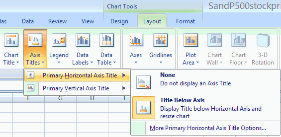
A vertical axis can similarly be added, where we ultimately select
Rotated Axis.
We obtain
PRINTING AND COPYING CHARTS
See Excel 2007: Formatting, Saving,
Printing and Copying
Results
CHANGE CHART SIZE AND POSITION
To resize the chart
- Activate it by clicking once inside the chart.
- Place the point of the arrow on one of the eight rectangular
handles
located on the charts border and click and drag the mouse.
The chart
will change size and shape depending on the direction of the
drag.
Experiment with the resizing until you get an idea of how it works.
To reposition a chart
- Place the point of the cursor in the chart border
- Click and drag the chart to a new position in the worksheet.
To remove a chart from a worksheet
- Activate it and then press
the DELETE key.
For further information on how to use Excel go to
http://cameron.econ.ucdavis.edu/excel/excel.html